Design
Landing pages that convert: a $0-budget playbook for founders
Eight patterns we use on nearly every landing page we build. None of them cost money. All of them cost discipline.
Iftekhar Newaz · 27 April 2026 · 8 min read
Most landing pages fail before the design loads. They fail in the argument. A visitor arrives with one question, 'is this for someone like me?', and the page answers with a feature list. Everything below is about argument first, decoration second. You can implement all eight patterns in a weekend with no budget beyond attention.
1. One page, one verb
Decide the single action the page exists to produce (book, buy, subscribe, request) and delete every competing action. Navigation links leak intent. The strongest landing pages we've shipped have exactly two clickable destinations: the primary CTA, repeated, and a low-commitment fallback, usually 'see an example'. Our own quote page follows the rule. The floating dock that lives on every other page disappears there, because the page *is* the dock.
2. The headline is the offer, not the vibe
'Empowering ambitious brands' is a vibe. 'Your first draft, free, in 12 hours' is an offer. If your headline could sit unchanged on a competitor's site, it's a placeholder. Write ten versions that each state a concrete promise, then pick the one you can actually keep.
3. Proof beats polish
- A real number ('46 sites in the archive') outperforms an adjective ('extensive experience') every time.
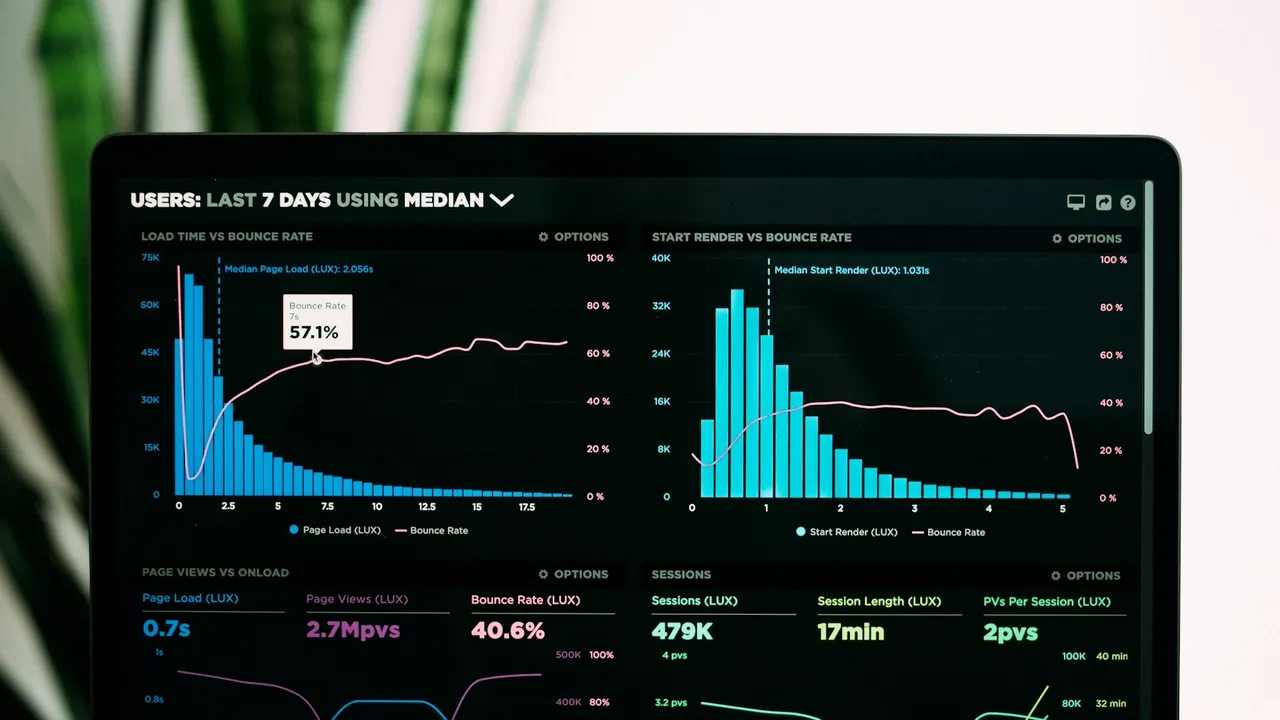
- A named metric with context, like 'conversion up from 1.8% to 2.6% after the redesign' (an illustration, not a claim of ours), outperforms a wall of logos.
- One specific testimonial ('there was a working draft before lunch') outperforms five generic ones ('great to work with!').
4. Price the floor, not the fog
'Contact us for pricing' converts founders who have time to waste. 'Landing pages start at $200' converts founders who have a budget and a deadline, which is the kind you want. Publishing a floor filters tyre-kickers and anchors negotiation in your favour. The fear that competitors will undercut a published price misreads what founders are buying. They're buying certainty, not cheapness.
5. The fold is an argument summary
Above the fold: who it's for, what they get, what it costs to try, and the button. If a screenshot of your first viewport were a cold email, would it get a reply? Design for that screenshot. It's what gets shared in Slack when your visitor asks a colleague 'worth a look?'
6. Friction budget: spend it all in one place
Every field in a form costs conversions, so spend fields where they earn trust. Our quote flow asks real questions about budget, timeline, and sites you hate, because a founder who answers them is qualified and invested. But it asks them one screen at a time, after the easy ones, with progress visible. Same total friction, wildly different completion rate.
7. Motion earns attention exactly once
One orchestrated moment buys credibility. A hero that assembles, a number that counts, a thread that draws. Ten scattered effects refund it with interest. If everything moves, nothing is emphasised, and on a landing page emphasis is the entire job.
8. End with the beginning
The bottom of the page is your second-highest-intent real estate. Everyone there either loves you or is looking for a reason to leave. Restate the offer in its strongest form, answer the last objection (an FAQ block does this cheaply), and repeat the button. Never let a page trail off into a footer while there's a deal on the table.
Iftekhar Newaz
Founder of Northcave Studio. Carves websites in Dhaka daylight for founders everywhere.